Digital presence
Offers
Payments
Transactions
Customer reach
Case study / BeNow / Mobile commerce
Making local commerce
feel naturally digital.
A FinTech mobile ecosystem I designed to connect neighbourhood merchants, familiar conversations, everyday payments, and transaction history.
Discover→Pay→Return
Role
UX Designer
Platform
Android mobile app
Domain
FinTech
Local commerce
Focus
UX · Interaction design
High-fidelity UI
One connected ecosystemLocal relationships,
Local relationships,
not isolated transactions.
01 / Project context
Bring everyday neighbourhood relationships into one digital experience.
Local merchants were already part of customers' routines-grocery stores, restaurants, pharmacies, salons, and service providers. The opportunity was to connect discovery, interaction, and payments without making those relationships feel unfamiliar.
How might we make interacting and transacting with local merchants feel as simple and familiar as any everyday mobile app?
02 / Understanding the ecosystem
Design the system,
not a set of screens.
The experience needed to serve three connected needs: help people find relevant businesses, make payments understandable, and preserve the relationship through favourites, conversations, offers, and history.
BeNow ecosystem
How merchants, customers, and the platform connect across local commerce.
Discover · Connect
Pay · Track · Return
Discover
Interact
Pay
Track
Repeat
Discovery
Find useful businesses through location, categories, and nearby context.
Transactions
Keep actions, methods, status, and history understandable and trustworthy.
Relationships
Connect merchants, favourites, conversations, friends, and offers.
03 / Information architecture
Five spaces.
One mental model.
Home establishes context. Merchants support discovery. Payments expose familiar actions. Social keeps people and businesses close. Transactions make the financial record visible.
Five spaces. One mental model.
A clear structure connecting discovery, action, relationships, and financial memory.
BeNow01Home 02Merchants 03Payments 04Social 05Transactions
Location · Actions · Categories
Nearby · Search · Offers
Scan · Pay · Split
Chats · Friends · Favourites
Status · History · Filters
04 / Core journey
A loop designed
for repeat value.
The journey does not end at payment. A useful local-commerce product helps people discover, evaluate, interact, pay, verify, and come back.
From nearby need to repeat value
The journey continues after payment, preserving confidence and relationship context.
01Discover→
02Evaluate→
03Interact→
04Pay→
05Verify→
06Manage→
07Return
Primary user flowOpen BeNow → Select location → Discover merchants → Choose an action → Confirm payment → Review history
A direct route through the ecosystem
Progressive choices keep the user oriented from location through confirmation.
01Open BeNow
02Select location
03Discover merchants
04Choose category
05Select merchant
06Chat or pay
07Confirmation
08Transaction history
05 / From structure to interface
Make hierarchy visible before adding polish.
Three reconstructed wireframes explain the product's information hierarchy. They are retrospective portfolio visualisations - not original research artifacts.
Merchant discovery
Retrospective portfolio visualisation of the interface hierarchy.
Relationships
Retrospective portfolio visualisation of the interface hierarchy.
Transaction history
Retrospective portfolio visualisation of the interface hierarchy.
Design discovery around intent - not only search.
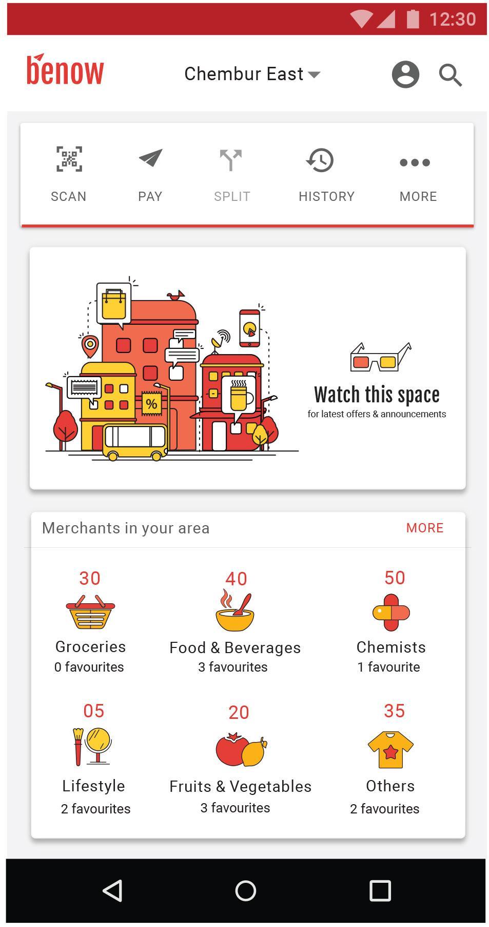
Location establishes context, frequent transaction actions remain close, and category browsing helps users begin with what they need even when they do not know a merchant's name.
Merchant discovery
From “What's nearby?”
to “What can I do now?”
- Location before discovery
- Scan, Pay, Split, and History as primary actions
- Categories organised around everyday intent
06 / Illustration system
Make FinTech feel
part of the neighbourhood.
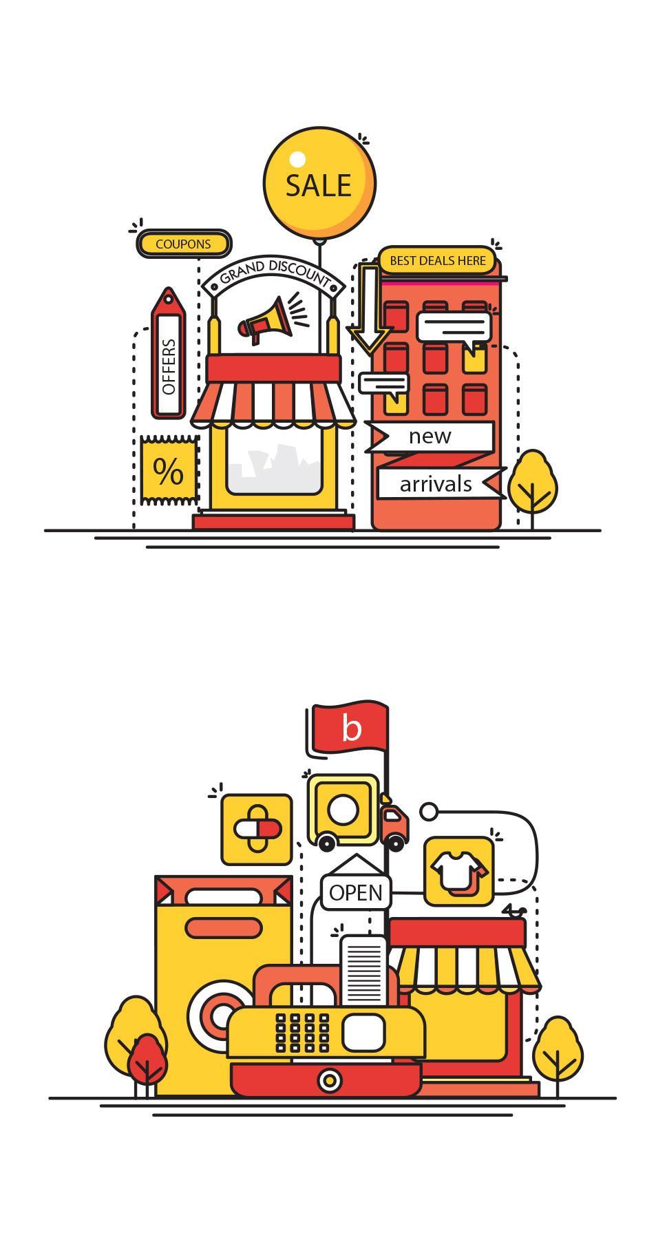
Playful line illustrations brought commerce, connectivity, offers, and payments into one approachable identity. The visual language made financial actions feel less institutional without compromising clarity.

Turn payments into relationships.
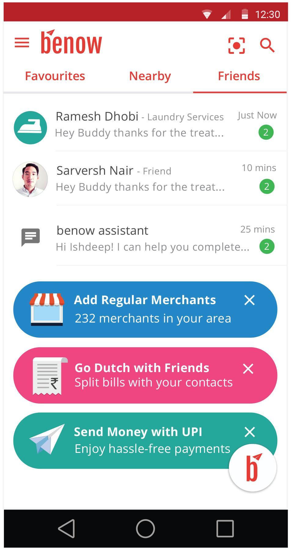
Merchants, friends, conversations, favourites, and actions share the same experience. A payment becomes one moment in an ongoing relationship - not an isolated event.
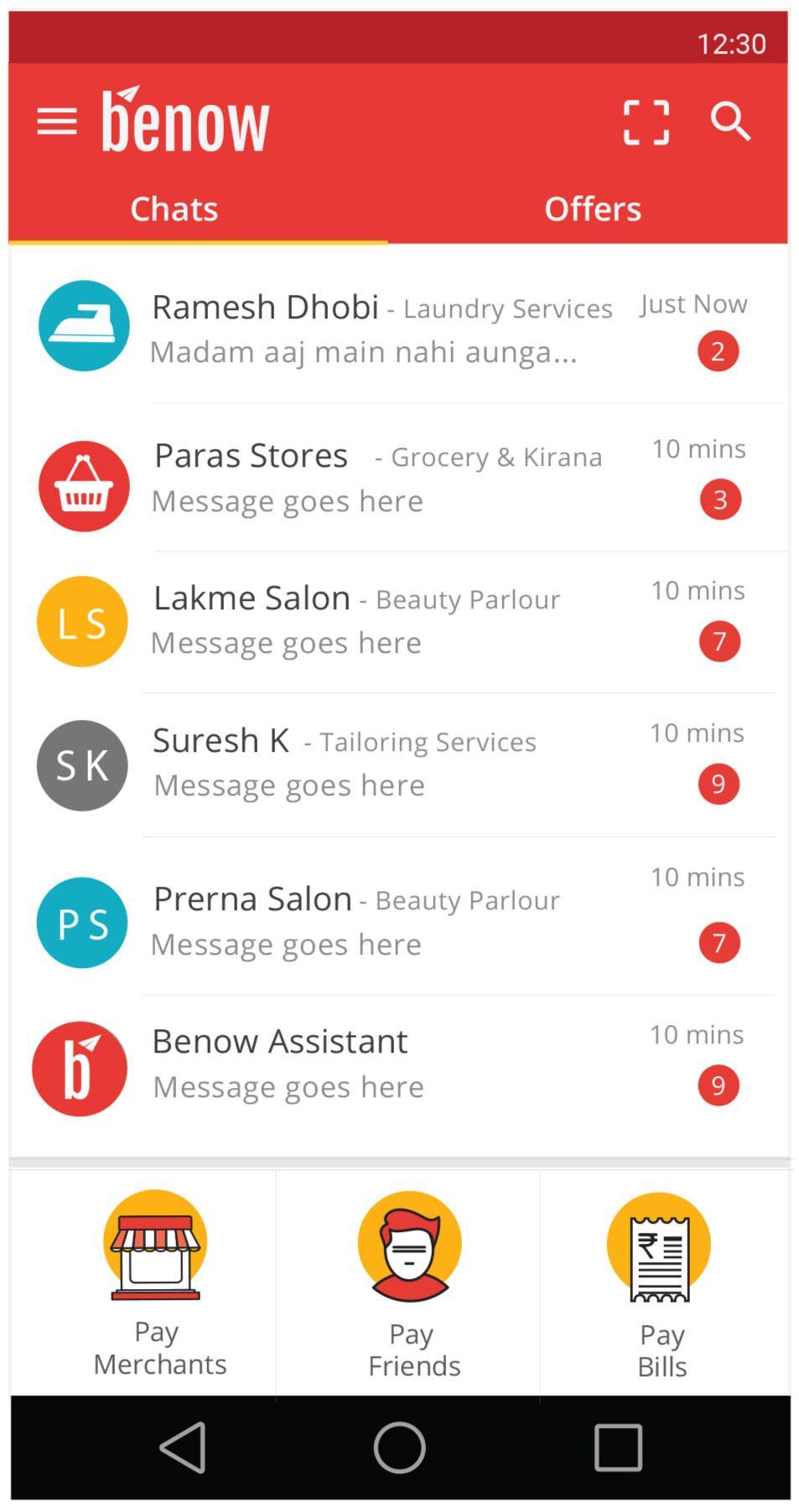
Relationship model
Familiar conversation patterns made the ecosystem easier to navigate.
In payment experiences, visibility is part of trust.
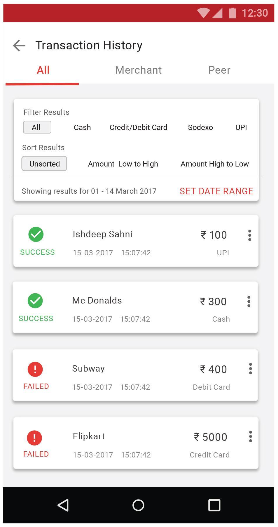
Clear status, payment method, date, amount, filters, and history help users understand what happened and what needs attention.
Transaction clarity
Status should be understood at a glance.
- Success and failure are visually distinct
- UPI, cash, and card methods remain visible
- Filter, sort, and date controls support review
- Merchant and peer context explains the transaction
07 / Visual language
A vivid identity held together by predictable patterns.
BeNow redAction yellowSurfaceText
01App header02Tab navigation03Merchant card04Category tile05Action shortcut06Transaction card07Success state08Failure state09Unread count10Secondary metadata
08 / Contribution
Connected local commerce,
without invented metrics.
Discover
Structured nearby merchants across everyday categories.
Connect
Brought merchant interaction and peer relationships into the ecosystem.
Transact
Supported multiple payment behaviours and contexts.
Return
Created repeat engagement through favourites, conversations, and offers.
Reflection
Complexity should stay behind the interface.
BeNow supported many merchant types, payment behaviours, and relationships. The interface's job was to make that ecosystem feel approachable, visible, and coherent.