Complexity
Interconnected workflows and system states
Case study / Canopy / Enterprise SaaS
Simplifying high-volume review, entity consolidation, QA, and sensitive-data configuration for an enterprise breach-response platform.
UX Designer
UX Strategy · IA
Data-heavy UX
Product · UX
Engineering · QA
Enterprise SaaS
Data Breach Response
01 / The context
Data breach response extends far beyond document review. Teams move projects through stages, identify and consolidate entities, monitor QA, configure sensitive PII rules, and understand progress across a connected system.
The design challengeHow might we make complex breach-response operations understandable without hiding the controls experts need?
02 / Understanding the system
Designing screens independently would have fragmented the experience further. The work started by understanding relationships between tasks, responsibilities, permissions, information, and system states.
Interconnected workflows and system states
Large volumes of documents and entities
Pending, completed, batched, and QA states
PII actions requiring deliberate control
Different access for admins, managers, reviewers
03 / Mapping the experience
The product was organized around the operational journey, creating a common structure for deciding where functionality belonged.
04 / Information architecture
Primary tasks remain inside the project workspace. Administrative controls live under Manage Project, preserving focus without removing capability.
Projects → Documents → Review → Entities → Uploads → Reports → Exports
General → Security → Templates & Layouts → Activity → Integration
05 / Project management
Status navigation, search, scannable metadata, contextual actions, and pagination help users find one matter among hundreds and take the next action quickly.
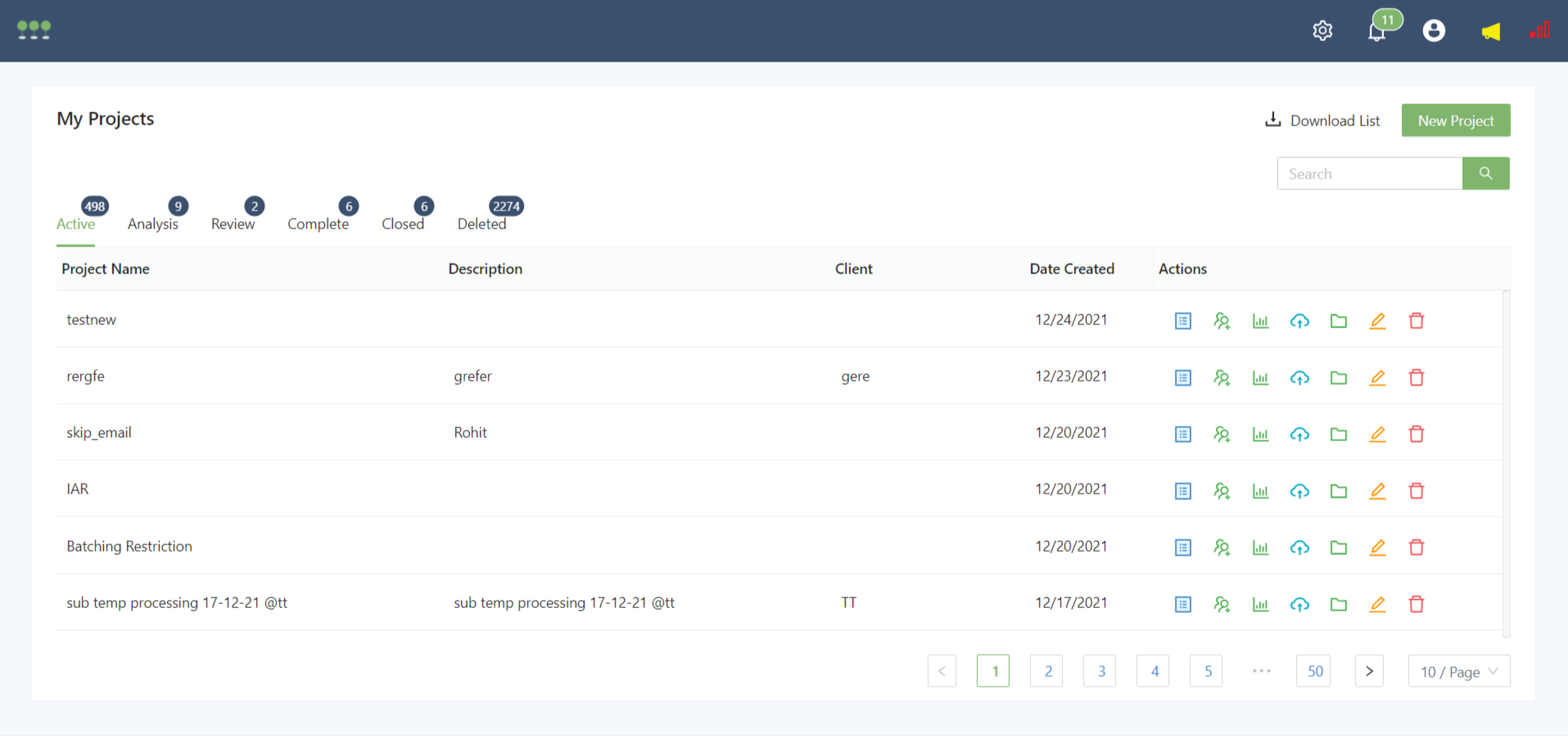
Every available project detail did not need to compete for attention in the initial view.
06 / Entity consolidation
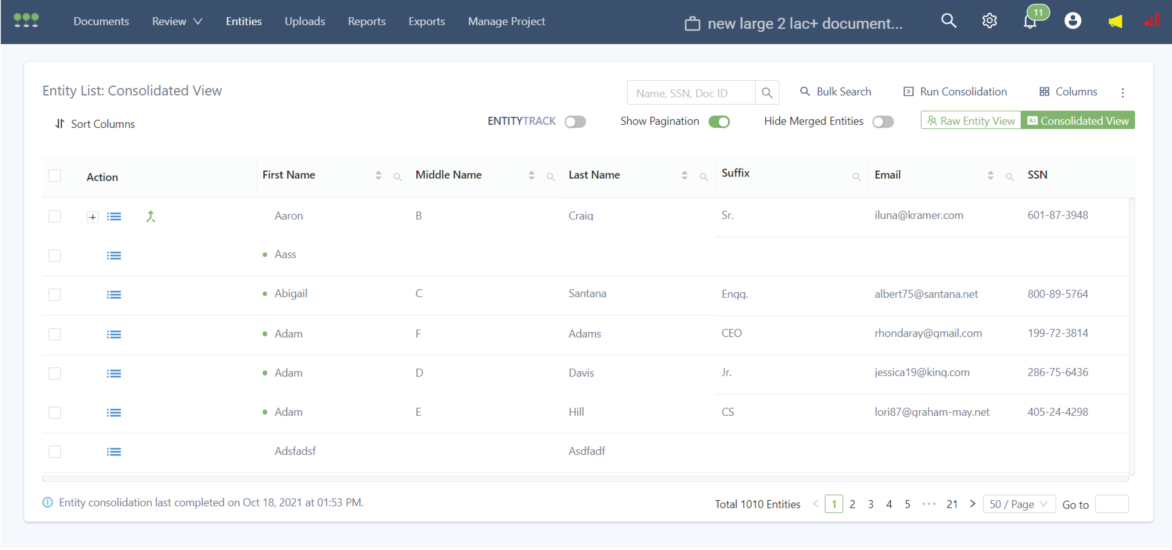
The data remained inherently dense. Clarity came from the tools around it: search, sorting, column controls, pagination, raw and consolidated views, and entity-level actions.
The interface helps users work with sensitive records without losing context.
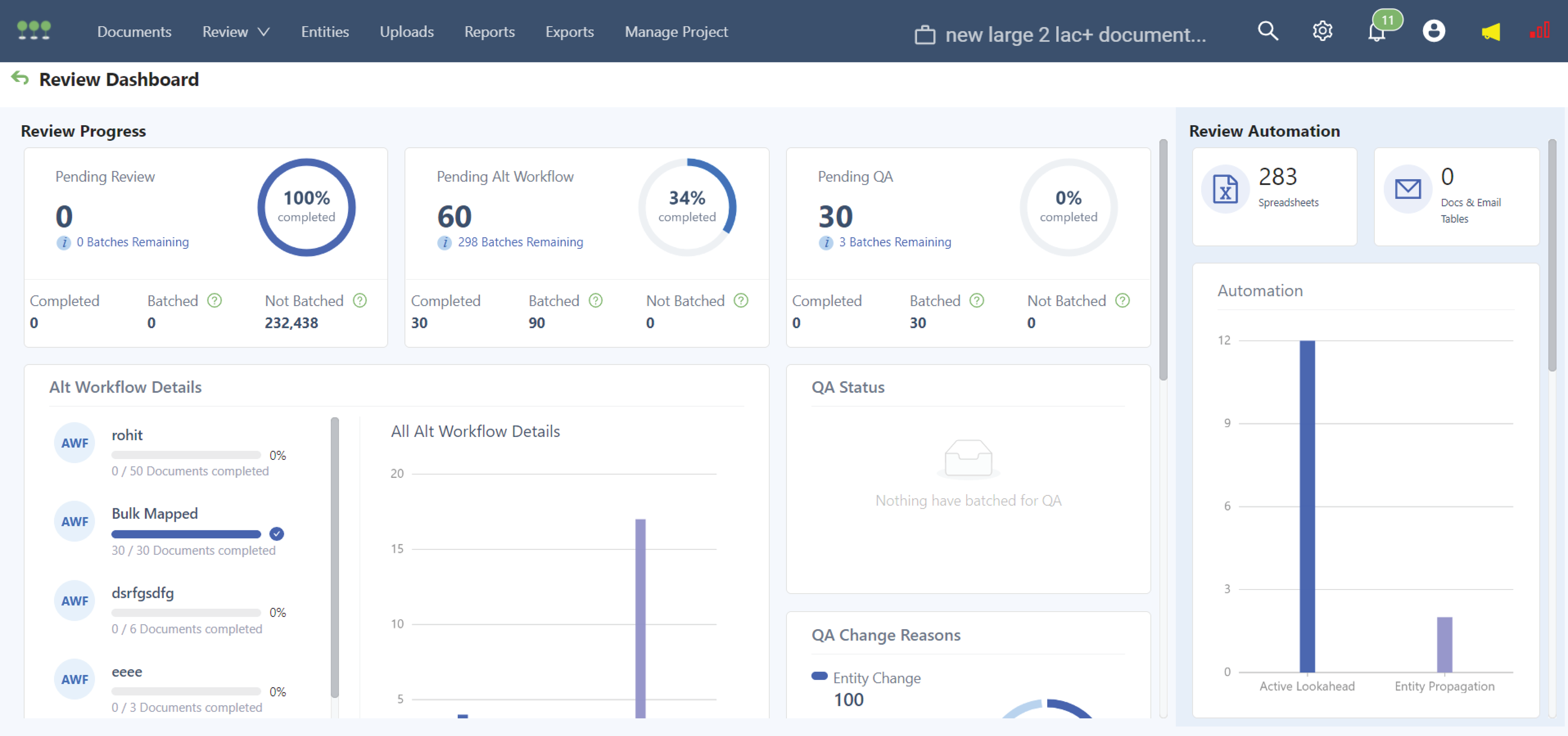
07 / Review visibility
Review managers needed to see what was complete, what required attention, and where workflows were slowing down before investigating details.
Immediate statusPending review, alternate workflow, and QA.
Operational progressCompleted, batched, and not batched.
Workflow intelligenceDetails, change reasons, and automation.
08 / Sensitive actions
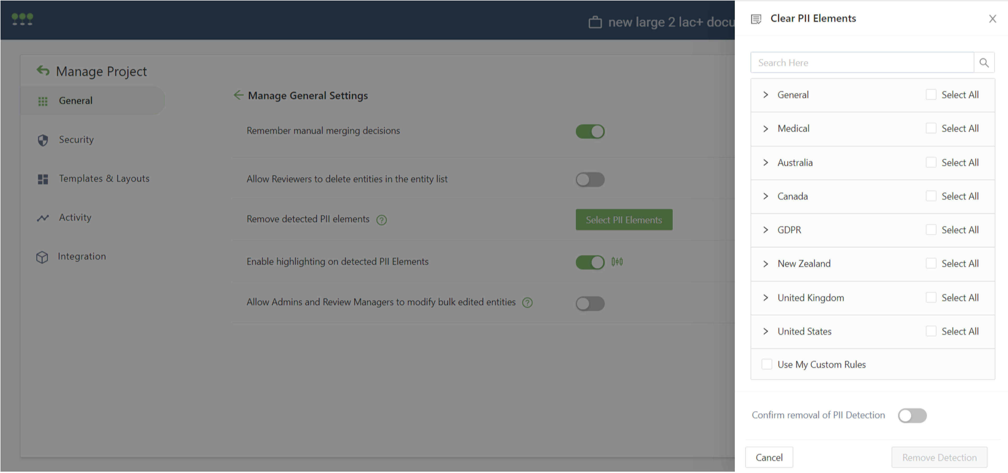
PII controls use explicit toggles, contextual help, categorized selection, regional groups, disabled states, and confirmation. A focused side panel provides space to review scope before committing.
The higher the consequence, the clearer the intent and confirmation.
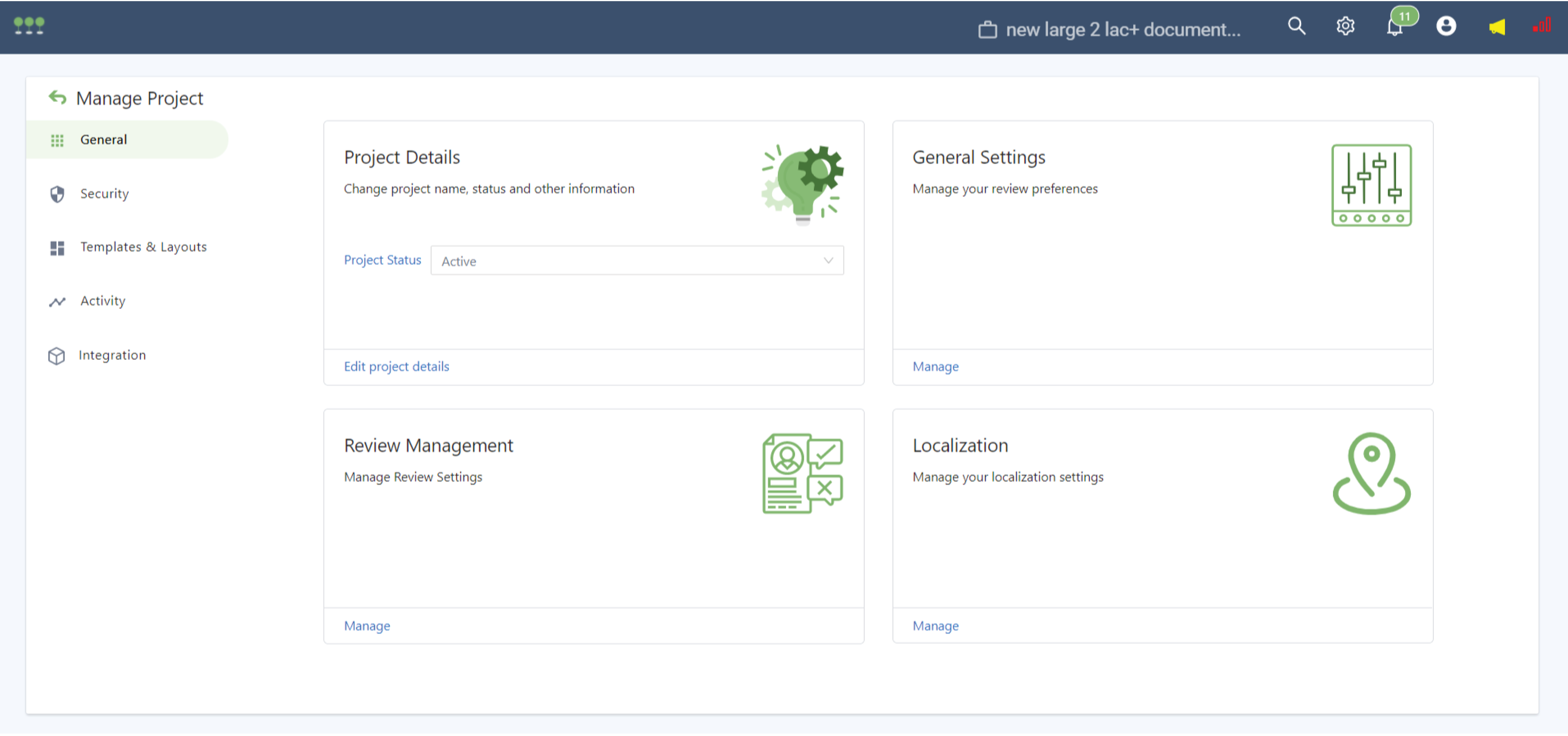
09 / Reusable patterns
10 / Prototype
The interactive prototype linked navigation, interaction states, and transitions across the platform's highest-density workflows.
11 / Design ↔ Engineering
Close collaboration translated UX decisions into reusable tables, cards, toggles, search patterns, navigation, and predictable system states.
12 / Impact
Review and QA progress in one dashboard
Search, sorting, pagination, and consolidated views
Clearer selection and confirmation for PII
Patterns shared across projects, review, entities, settings
Architecture prepared for increasingly complex workflows
Reflection
The goal was not to make breach response simple. It was to make complexity understandable, navigable, and actionable.