Average manual effort per enquiry
Case study / Staycationer / 2026
From three hours
to a few minutes.
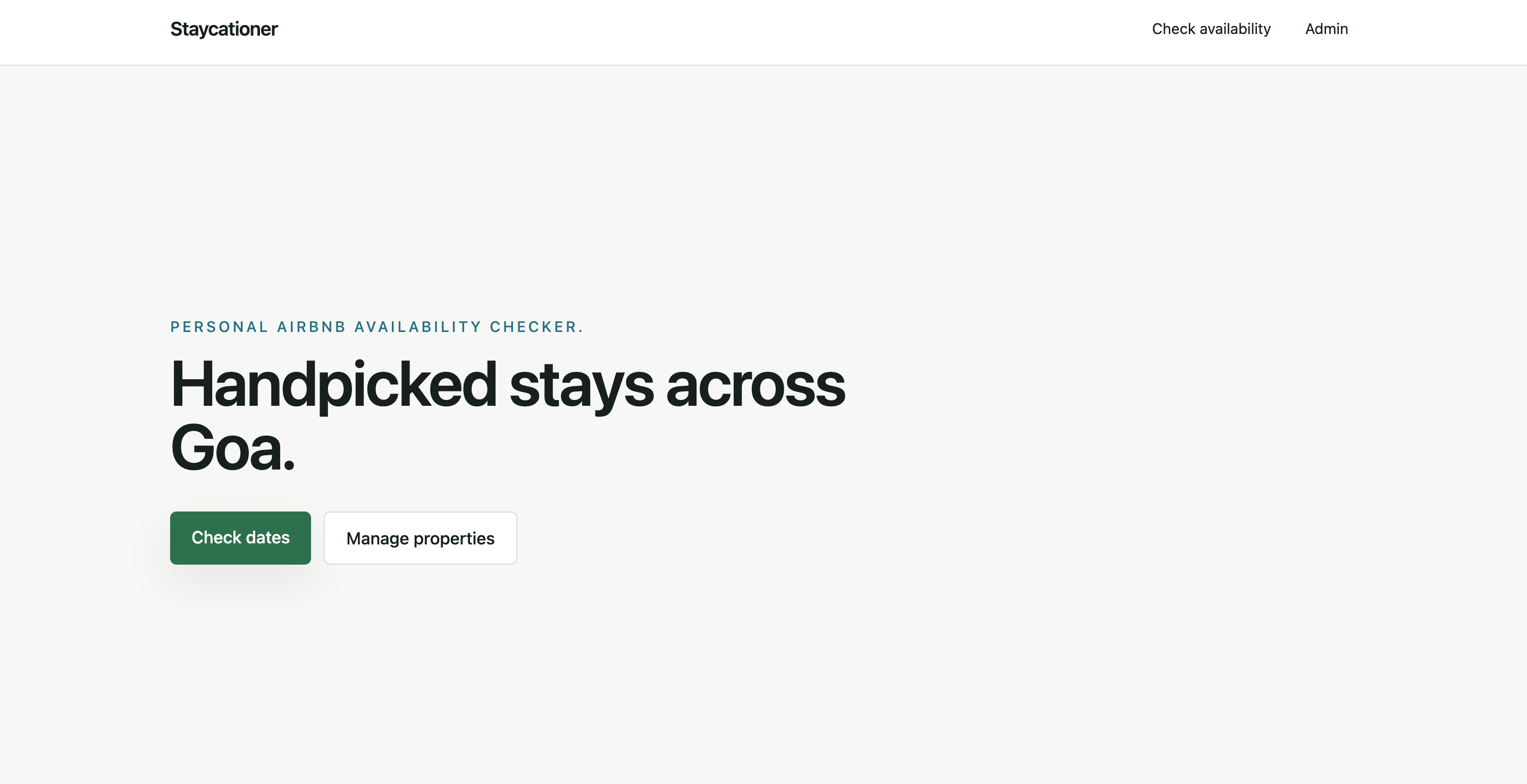
An internal SaaS tool that helps an operations team search 200+ villas, check real-time availability, and answer customer enquiries faster.
2–3 hrsbecameMinutes
Role
Senior UX Designer
& Developer
Scope
Discovery · UX Strategy
UI · Development
Timeline
1 week
Product
Internal SaaS
TravelTech
01 / The challenge
A customer enquiry shouldn't take three hours to answer.
Responding to a simple villa enquiry meant moving between spreadsheets, Airbnb listings, property records, and brochures - repeating the same process across multiple properties.
01Customer enquiry→
02Search spreadsheet→
03Open listings→
04Check availability→
05Find brochures→
06Respond
Villas potentially requiring checks
Spreadsheets, Airbnb, PDFs, records
How might we help the team find relevant, available villas without manually searching multiple systems?
02 / Framing
I started with the workflow, not the interface.
The real friction wasn't availability alone. It was the repeated movement between disconnected sources of information.
The product didn't need more information. It needed the right information together at the right moment.
Operational frictionProduct decision
01
Searching spreadsheets
→Searchable property inventory02
Opening listings one by one
→Automated availability checks03
Too many irrelevant villas
→Location + bedroom filters04
Scattered property context
→Unified records + brochure05
Waiting without feedback
→Progress + explicit status06
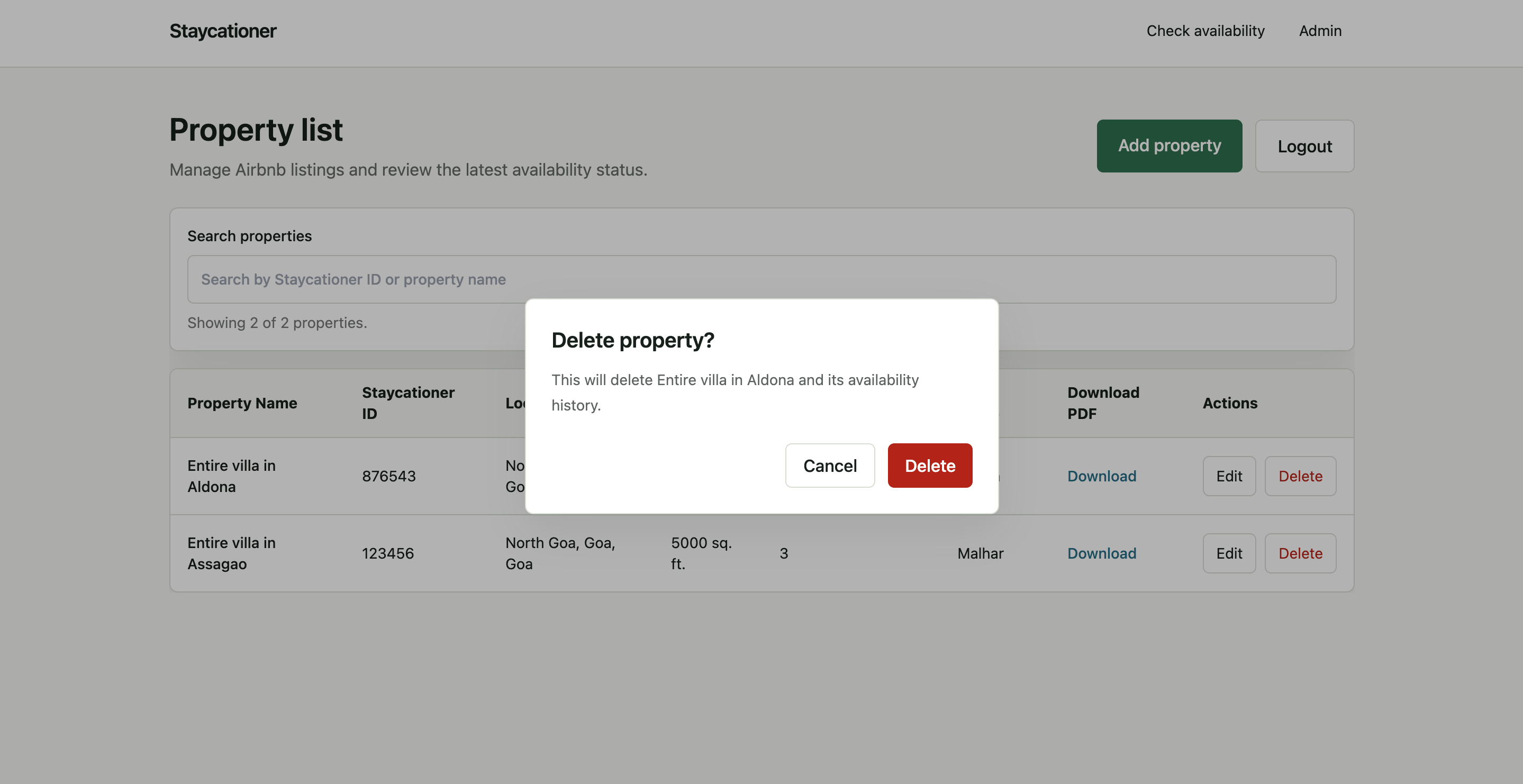
Risk of deleting inventory
→Confirmation before deletion03 / Product architecture
Two jobs.
Two clear paths.
Operational users care about completing tasks quickly, not exploring a product. The architecture stayed deliberately shallow.
Check availability
Dates → Filters → Check villas → Review results → Open Airbnb or brochure
Manage properties
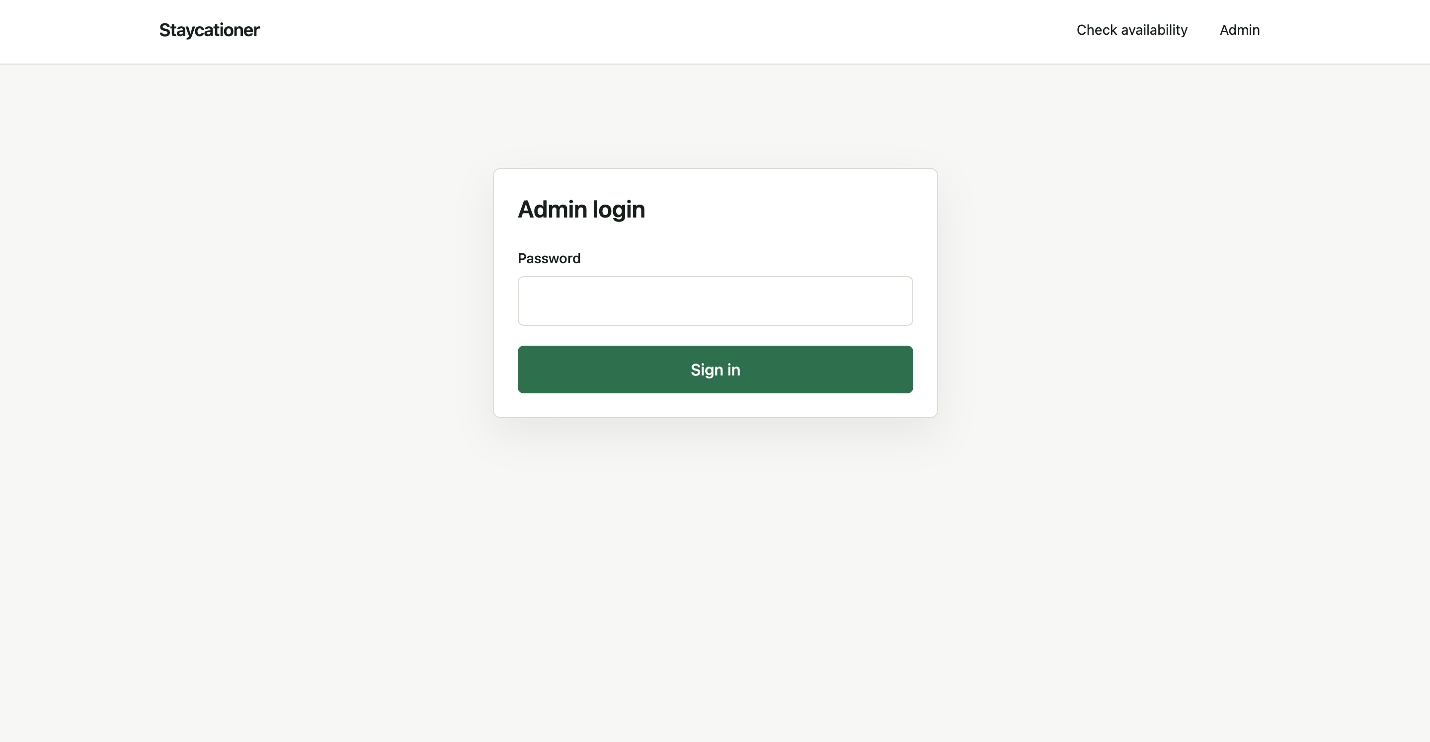
Login → Search inventory → Add, edit, or safely delete a property
04 / Core journey
Filter first.
Process second.
The core screen asks only for the information required to narrow the search. It shows the number of matching properties before the availability check begins.
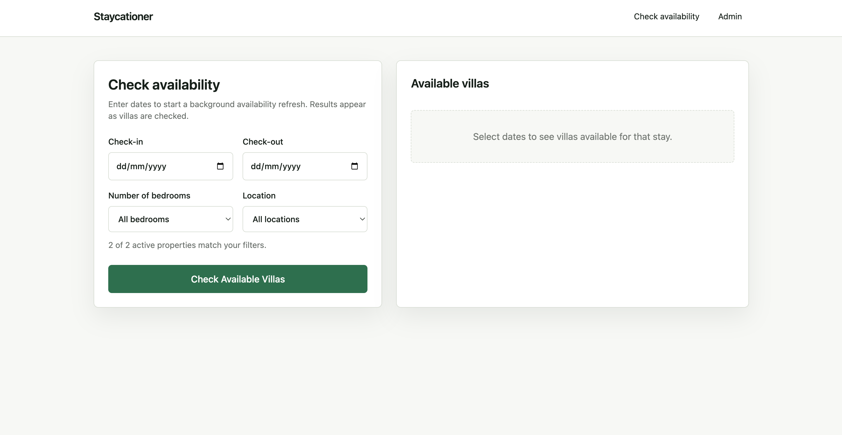
Before
Spreadsheet → Airbnb → Airbnb → PDFs → comparison → responseAfter
Staycationer → available villas → response05 / Decision-ready results
Availability is not the decision.
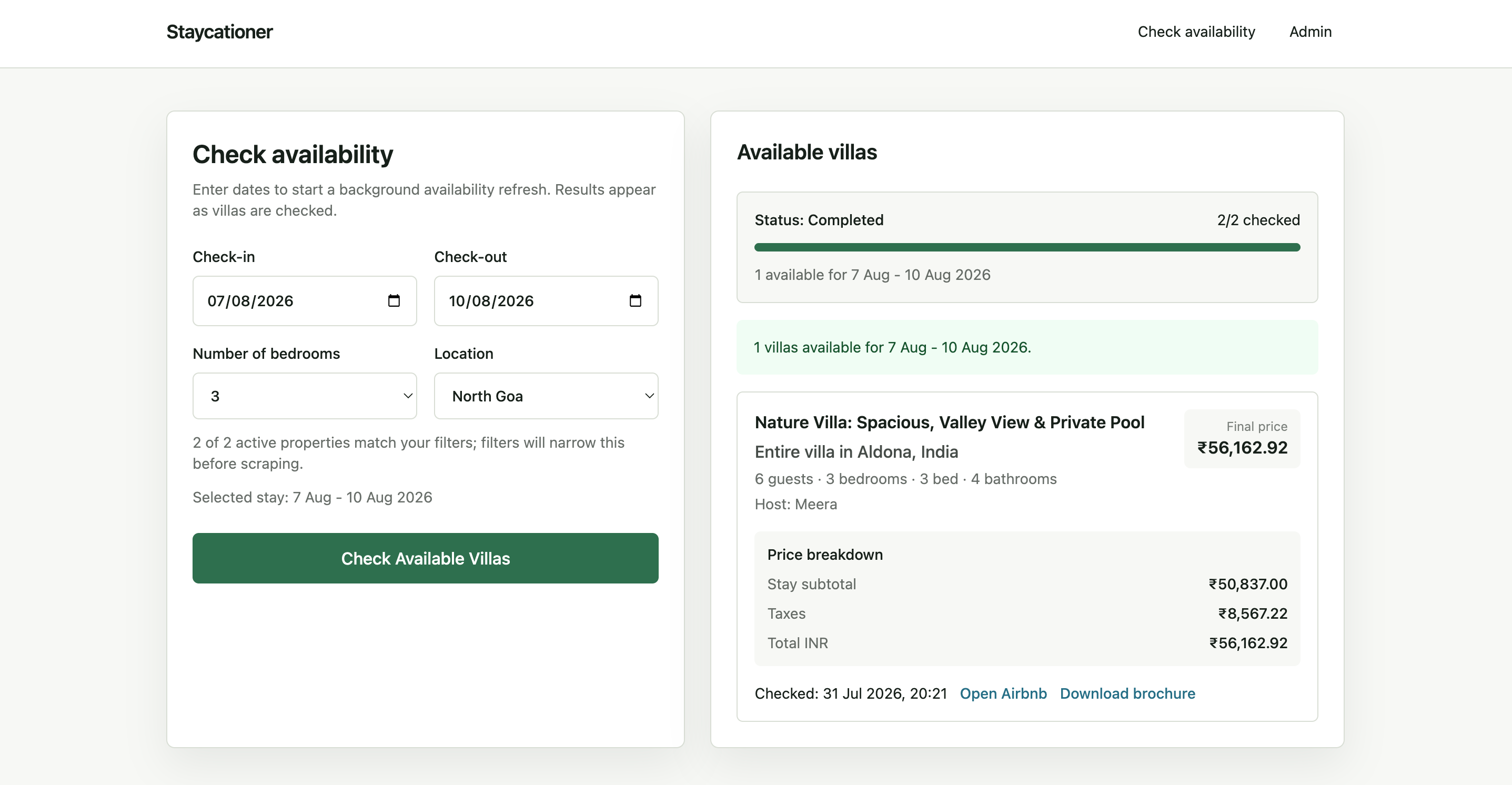
A result combines capacity, location, host, final price, price breakdown, brochure, listing link, and last-checked time - enough context to decide what to send the customer next.
The interface moves the user from “Is anything available?” to “Which villa should I recommend?”
06 / Designing for operations
The customer journey depends on clean inventory.
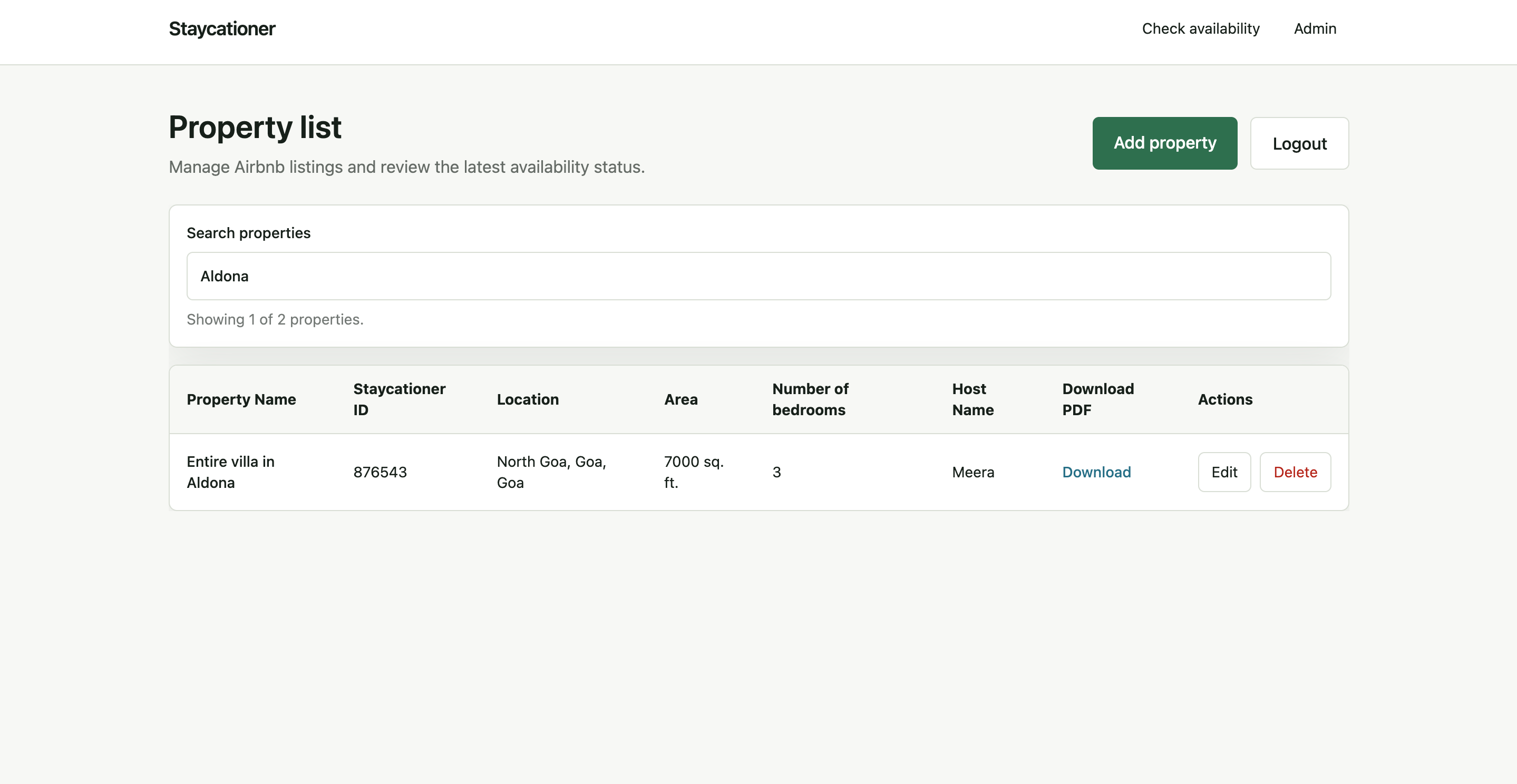
A lightweight admin system keeps the underlying records searchable, structured, current, and safe to change.
Searchable inventory
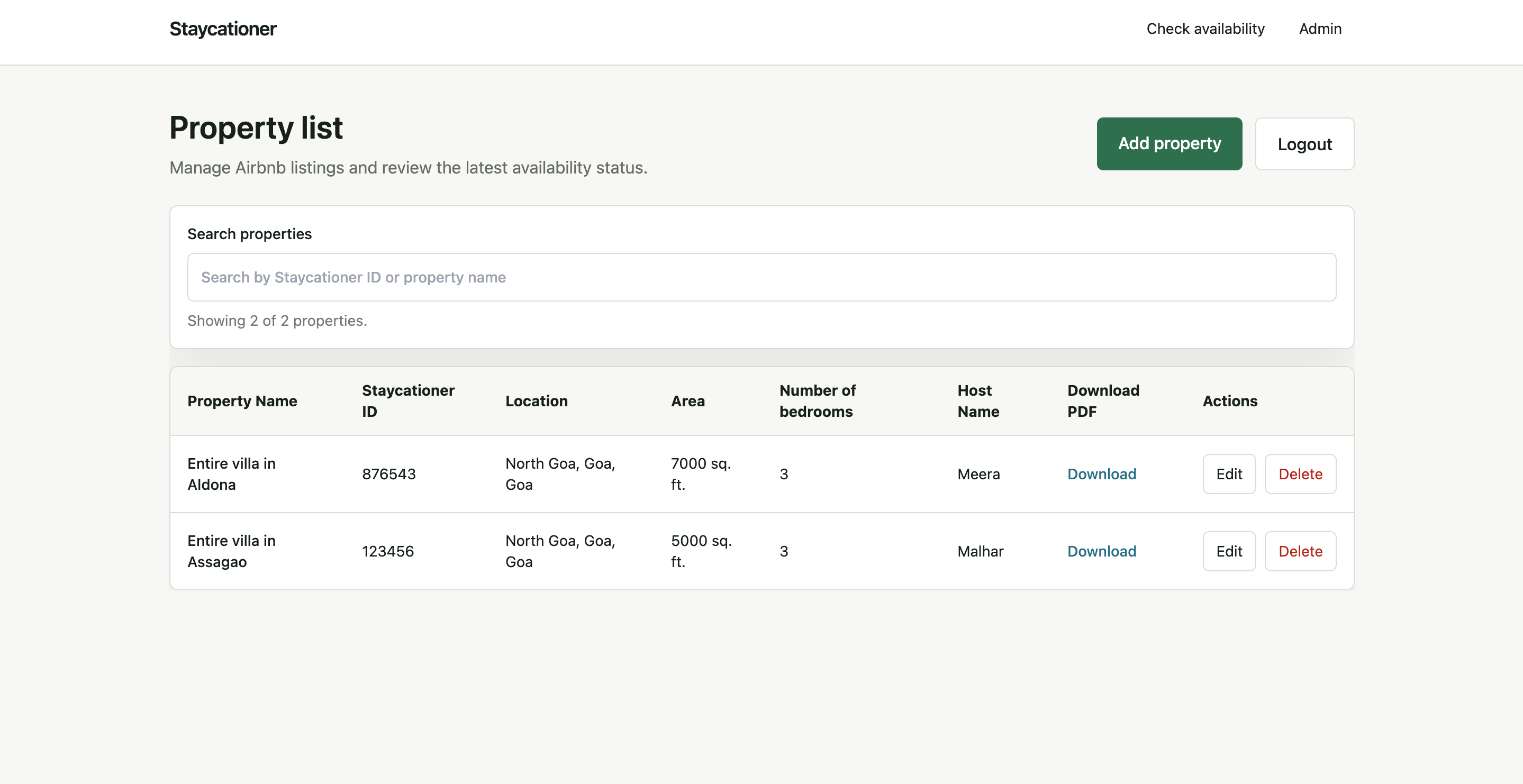
Fast retrieval
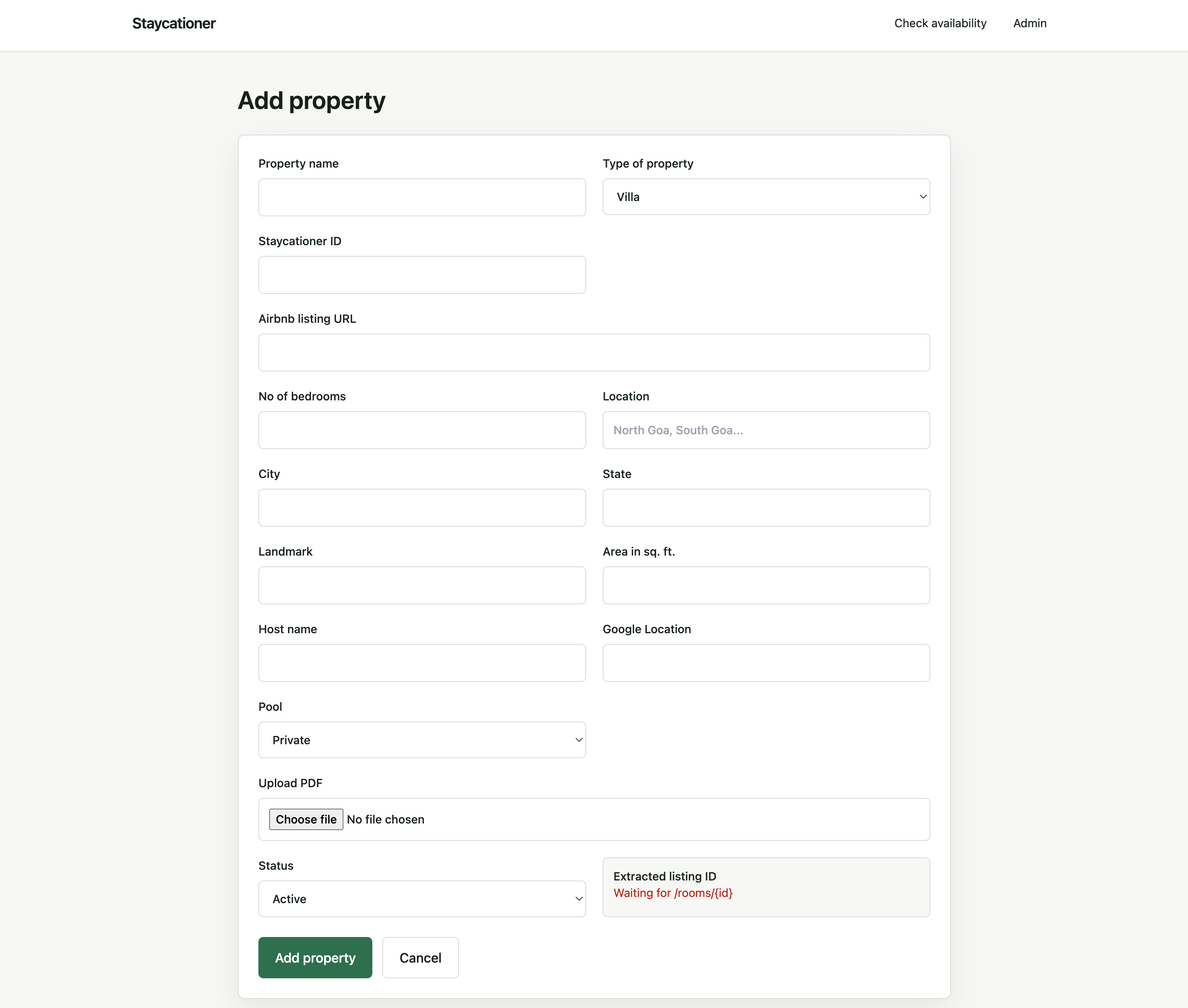
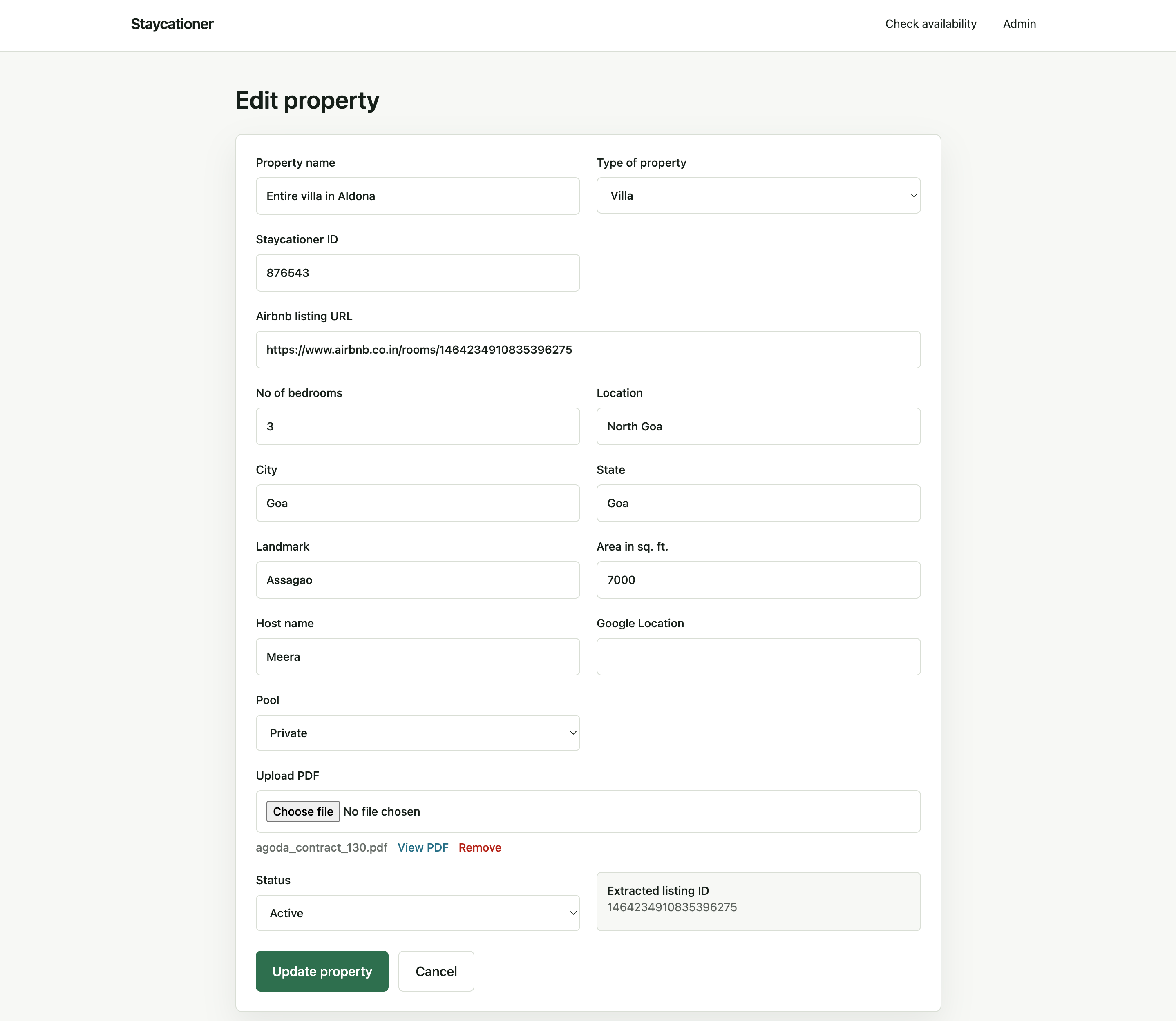
Reuse the same structure for Add and Edit.
Familiarity reduces learning. The system can also derive the Airbnb listing ID rather than asking an administrator to duplicate it.
Error prevention
Make the consequence visible before the action.
Deletion affects both inventory and availability history. The confirmation identifies what will disappear and requires a deliberate second action.
07 / A lightweight design system
Consistency over decoration.
PrimarySurfaceTextDestructive
01Text field02Date picker03Select04Search05Primary action06Table07Result card08Modal09Progress10Empty state
08 / From UX to product
I didn't stop at the prototype.
Design and development happened together. Background processing shaped status feedback. Real data shaped hierarchy. Implementation exposed edge cases that static mockups would not.
01Understand02Frame03Design04Build05Test06Ship
09 / Business impact
Time returned
to the business.
Manual shortlisting across multiple systems
Search and availability in one focused workflow
From understanding the problem to a working product
“We were quoted lakhs and months to solve this problem. Dhawal built it in one week.”- Staycationer founder
Reflection
Operational products create value when they remove work - not when they add features.
Understanding the workflow first revealed where technology could remove repetition and where people still needed visibility and control.